The Three Most Common Charts
No matter which broker you choose they will all provide you with their free software packages and they will all come with different default charting options. There are three common types of chart though that are guaranteed to be available to you. Let's start with those and later on you will be introduced to some alternatives.
The three most common types of chart are:
- Line Chart
- Bar Chart
- Candlestick Chart
Line Chart
The line chart is the most simple from of trading chart and consists of a single line that connects one closing price to the next. The only thing you need to do is select the time frame difference between each closing time. For the purpose of this explanation we will use the daily time frame which means that each closing price will be 24 hours apart.

Each closing time is a full day apart but this entire chart is actually showing you the price action over 1 year.
Bar Chart
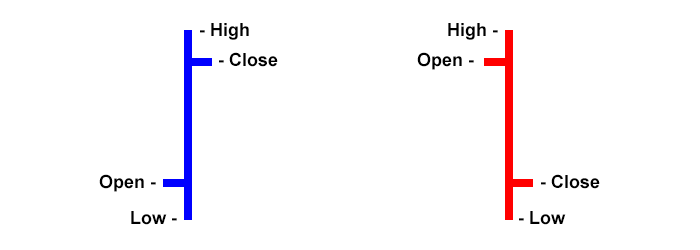
Bar charts step things up a little bit because now you are able to see the opening and closing prices, plus the highs and lows that were made over the duration of the bar. Once again in this next image, we will use the daily frame which means that each bar represents 24 hours of time. These charts are also known as 'OHLC' (Open-High-Low-Close) charts.

The very bottom of the bar shows you the lowest price that was traded and the very top of the bar shows the highest. The bar itself between the high and the low indicates the full trading range that was traded over its duration. The small horizontal dash sticking out to the left on each bar is the opening price and the small horizontal dash sticking out to the right is the closing price. It's a little tricky to see in that image because it spans 1 year so let's look at a bar by itself.

To the right, we have a blue bar that has a closing price higher than its open price, also known as a bullish bar. To the left, we have a red bar that has a closing price lower than its open price, also known as a bearish bar. The colors used for each are configurable by the user on their trading platform. Here at WaveFX Trading, this is our color preference. Your trading platform will also allow you to select what period of time each bar represents.
Candlestick Chart
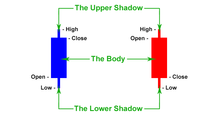
Candlestick charts pick up where the bar chart left off and introduce a more graphical way to read the information. The high-low range remains just a line as it was on the bar chart but now the open-close price is filled in with a body. In this next image, we will stick with the daily time frame so that you can compare to the above charts.

With the candlestick charts comes some more trading talk and ways for you to separate the parts that make up a candlestick. The filled-in area between the open and the close price is also known as the 'body'. The spikes that you can see coming out of the top and bottom of the body are called the 'shadows' but sometimes are referred to as the 'wicks'. Once again we are looking at 1 year of candlesticks in that image so let's zoom in and take a closer look.

To the right of the image, you will see a blue candlestick that has a closing price higher than its open price, also known as a bullish candlestick. To the left is a red candlestick that has a closing price lower than its open price, also known as a bearish candlestick. Just like with the bar charts you can choose your own colors and you will also be able to choose which time frame each candlestick represents.
Candlestick charts are the most popular of these top 3 types of chart because they are easy to use and interpret. They present the information in a way that creates definable patterns that repeat themselves. We will dive further into candlestick patterns in the next lesson and you will have a clearer understanding of what that means.